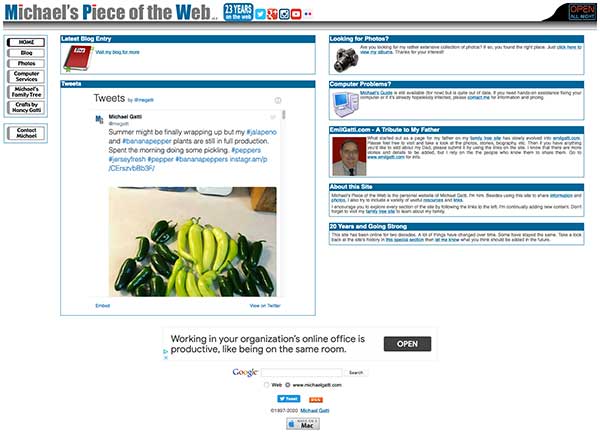
More than 25 years ago, with no knowledge of HTML, I threw together a website using Claris Home Page 1.0. I uploaded it to the free FTP space that every AOL member received and suddenly I had a website. OK, so maybe "website" is a little bit of an exageration. It was basically just one web page. Now a two decades and several revisions later, it's turned into a hobby and learning experience. This is just a quick look back at how the site came to be what it is today and what it looked like through each revision...
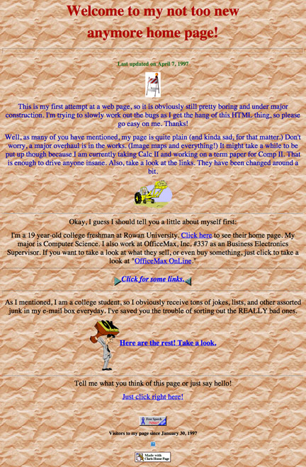
This is the page that started it all. There were few graphics and little content. One notable feature was the joke archive. Keep in mind that this was back in the days before spam and before people forwarded every piece of junk that showed up in their mailbox and ruined things. There were some really funny things going around. When I was in high school, we would even print them out and share them since very few people had access to e-mail. I used to receive mine in my first e-mail account at GTE.com. It was a receive only address. Can you imagine? AOL wasn't connected to the internet yet at that point! It was a standalone service.
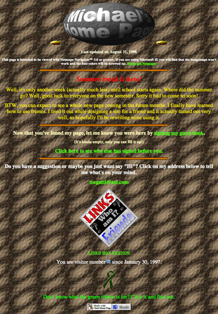
Version 2.0 of my site featured a guestbook, a friends page, a biography page and a really tacky appearance that could make your eyes bleed. Sure, it wasn't very easy to read with the terrible background, but I did get rid of the clipart in favor of designing all of my own graphics! I very creatively called this site Michael's Home Page. The joke archive didn't make the cut. By this point in time, everyone had read the good ones a thousand times over and were just annoyed by people who forwarded crappy jokes.
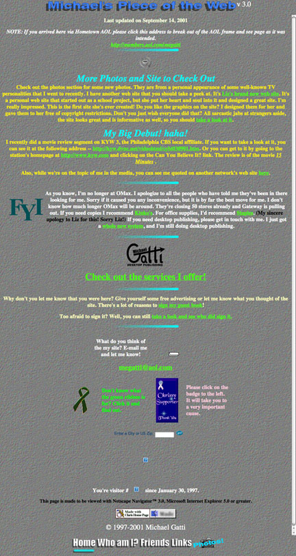
As the new century came upon us, so did version 3.0 of the site. It was the first version of the site to bear the name Michael's Piece of the Web. The graphics were more tasteful and there was a bit of continuity between pages. No more wild backgrounds though I managed to keep a tiled background because the clean sites of Web 2.0 hadn't become en vogue yet! The site was still going through its awkward phase. It also included the debut of the photo gallery, which would eventually become the biggest part of the site. I even decided to get fancy and add frames.
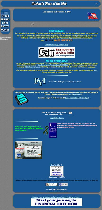
Version 4.0 was a big upgrade that featured a brushed metal look. It took the use of frames to a new level that mostly just drove me nuts. It included a short lived quotes archive. The Java news scroller wasn't very well written and slowed things down constantly. All in all, I always thought this version of the site had a cool look, but honestly it was a huge pain in the butt to maintain. The complex table and frame structure broke constantly. My sole motivation for moving on from this format was that I needed to either simplify the site or never update it again!
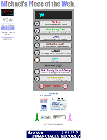
Version 5.0 did simplify the site. The only thing complicated about it was the elevator button navigation system. No one but me understood what the letters meant once they left the homepage. It did, however, make the site more fun. As Marianne once put it... Everyone loves to press elevator buttons! Speaking of the homepage, it was so simple that all it included was a menu. The elevator buttons and spartan homepage both went away when I moved to the next version. This was also the last version designed with Claris Home Page. I finally graduated to Adobe GoLive which was eventually replaced by Dreamweaver when Adobe bought Macromedia.
The last version of my site that I designed using Adobe Dreamweaver was also the longest lived. It lasted for well over 10 years. It featured a WordPress blog, a massive photo library that grew to nearly 12,000 photos and featured some Twitter integration. It even had a section for my mother's growing craft business. The logo also got a minor tweak when I changed the shade of blue used throughout the site. You noticed that, right? It ran mostly on autopilot until it began to become outdated. It wasn't mobile responsive and it still used software that was no longer compatible with today's 64-bit operating systems. That's what drove the move to the all WordPress site that you see in front of you today.
